The Client
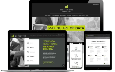
EOS Healthcare Marketing is a marketing agency based in Lone Tree, Colorado primarily serving dentists, veterinarians, and optometrists. They had outgrown their original Squarespace website, so I was tasked with bringing their unique design to life on a different platform. Since their client sites are built with WordPress, the site was also developed on WordPress using the Divi framework.
Challenges
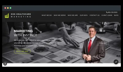
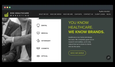
A total site rebuild was required. One of the main challenges with this project was the monochrome design, accented with neon green. The lack of color gives the site a very drab feel, like a newspaper, so I added interest with CSS and JavaScript hovers, as well as background animations. I was careful to use these animations sparingly so as not to overwhelm the user and slow the site's load time.
There was also a great deal of layering in the design, which required a lot of fine-tuning in CSS to keep each page responsive.
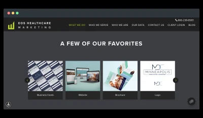
Oddly enough, despite focusing on digital marketing, there is little in the site copy to suggest this is a large portion of EOS' business model. Instead, the copy showcases the company's use of "data." I suggested that the company dedicate more space to showing users their work in building websites. EOS later addressed this omission by including "case study" sub pages.
The Result
The site stays true to the original design, and EOS was very satisfied with the result. As of today, they are continuing to use the site, and are expanding the blog and adding new sub pages.

